Tag Archives: bad graphic design

Hey, they fixed Bruce’s banner!

As I surf the web, the banner ads for Phil Scott and Bruce Lisman continue to follow me like the shambling monster in “It Follows.” Last week, I noted the graphic-design shortcomings of both campaigns’ efforts — with Lisman’s being the worse of the two.

Well, maybe they read my post, because they’ve put up a new and much better banner ad.

Continue reading

Advertisement

Adventures in bad banner design

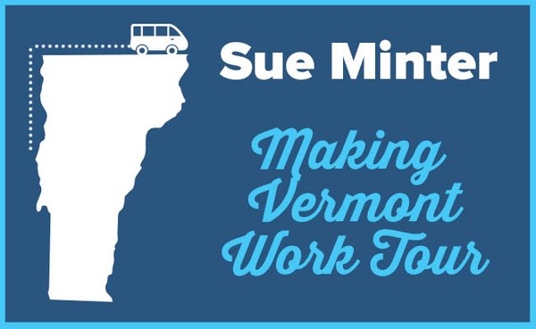
You know how online advertising works. You shop for something on the Internet — socks, refrigerators, hotels — and you get a torrent of related banner ads wherever you browse.

So me, politics. I’m getting a load of banner ads from candidates. Ironically, mostly Republicans. (The tracking software doesn’t detect sarcasm.) And, given the relative rate of spending, mostly about Bruce Lisman.

My conclusion: whatever he’s spending all that money on, he’s getting screwed on graphics. Just look at this.

Lisman banner ad from Politico

Ugh. Looks like a quick cut-and-paste job by a hyperactive five-year-old with a rudimentary grasp of Photoshop. Cluttered, random, doesn’t stand out, doesn’t guide the eye, too many messages. And then there’s that terrible photo crammed into the middle: why would you want to show your candidate squinting?

More bad banners… after the jump.

Continue reading

Adventures in Unfortunate Graphic Design

Generally speaking, Sue Minter’s gubernatorial effort has taken on a sharper edge since Molly Ritner came on board as campaign manager. They’re quick on the draw with statements on the issues, they’ve got Minter out and about quite a bit. And they came up with a nice way to spotlight a liberal jobs agenda: the Making Vermont Work Tour.

Arguably derivative of Pihl Scott’s Vermont Jobs Tour, but a good way to push back on Republican claims that Democrats are job-killers.

However… this logo.

MinterLogo

I take one look at that, and I see the bus about to go off a cliff.